
Your Guided To Colour At Home
Colour is the spice of life. However, when used in abundance, and in different ways, colour can overwhelm even a great design. It’s time to learn the tricks of the trade and use colour like a professional. Here we bring you a guide to decorating with colour at home…
![]()
![]()
![]()
![]()

Forgot monotone rooms or black and white statement spaces. Colour is a way to infuse a space with personality and boost the mood. This season we’re embracing a more colourful way of life. As such, it’s important to understand colour psychology and what colours can symbolise and make us feel.
Colour psychology is the study of how certain colours impact human behaviour. Different colours have different meanings, connotations, and psychological effects that vary across different cultures. Along with cultural differences, colour psychology is largely impacted by personal preference.
Colour Psychology can be related to all aspects of life. Still, in interior design, it is an essential instrument for understanding each shade’s meaning and choosing the one that better reflects the interior needs.
In the study of colours, two categories help us better understand the meanings behind each shade; the warm and the cool colours. While the warm hues are associated with strong emotions, passion, and joy, the cool colours help to activate peaceful and refreshing feelings.
Colours close to the red spectrum are warmer colours, including red, orange, and yellow. These warm colours evoke emotions ranging from feelings of warmth and comfort to feelings of anger and hostility. Whereas blue colours like purple and green are known for evoking feelings of calm, sadness, or indifference.
Warm colours often evoke feelings of happiness, optimism and energy. However, yellow, red and orange can also have an attention-grabbing effect and signal danger or make you take action (think stop signs, hazard warnings and barrier tape).
Psychological Effects of Cool Colours
Need to be creative? Want help getting those brain synapses firing? Try utilizing the colour purple. Purple utilizes both red and blue to provide a nice balance between stimulation and serenity that is supposed to encourage creativity. Light purple is said to result in a peaceful surrounding, thus relieving tension. Purple emanates peaceful, dreamy, and nostalgic feelings. This hue can be charming and bold. These could be great colours for a home or business office.
![]()
![]()
![]()
![]()
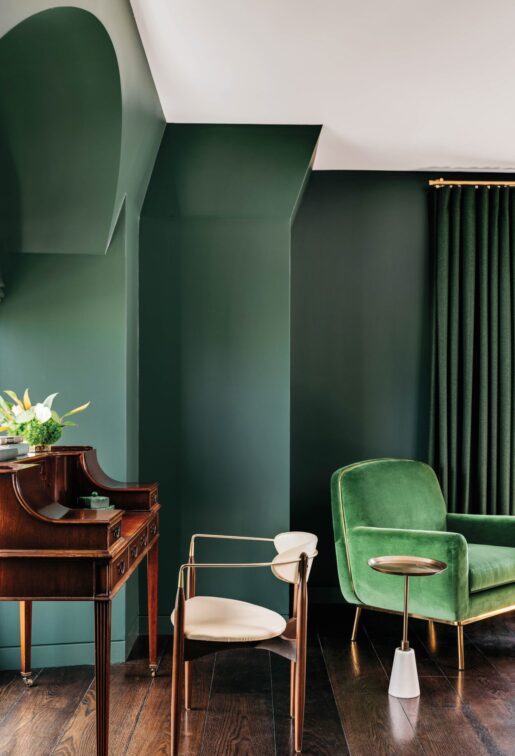
Green
Are you looking for a peaceful and calming environment? You might consider using green or blue. These cool colours are typically considered restful. There is actually a bit of scientific logic applied to this – because the eye focuses the colour green directly on the retina, it is said to be less strainful on your eye muscles. Furthermore, green is a colour based on nature, which lies between blue and yellow. It is ideal for energizing and encouraging a healthy state of mind.
![]()
![]()
![]()
![]()
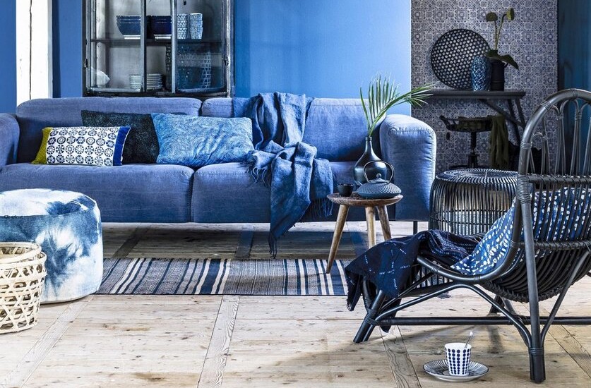
Blue
Blue is one of the primary colours and one of the most flexible hues, which can be serene and exciting. The colour blue is suggested for high-traffic rooms or rooms that you or other people will spend significant amounts of time. Another cool colour, blue is typically a calming and serene colour, said to decrease respiration and lower blood pressure. The bedroom is a great place to use these colours as they should help you relax
Psychological Effects of Warm Colours
Want to create an environment of stimulation or whet people’s appetite? You might consider utilizing the colours yellow or orange. These colours are often associated with food and can cause your tummy to growl a little. Have you ever wondered why so many restaurants use these colours? Now you know why even after people watched the movie SuperSize Me, they said they were hungry.
You do want to be careful about using bright colours like orange and especially yellow. They reflect more light and excessively stimulate a person’s eyes which can lead to irritation. You also probably don’t want to paint your dining room or kitchen these colours if you’re a calorie counter.
![]()
![]()
![]()
![]()

Red
Red is a colour that draws attention and is linked to powerful feelings like love, passion, and rage. It denotes strength, power, bravery, and danger. Red is vibrant, energizing, and intriguing.
![]()
![]()
![]()
![]()
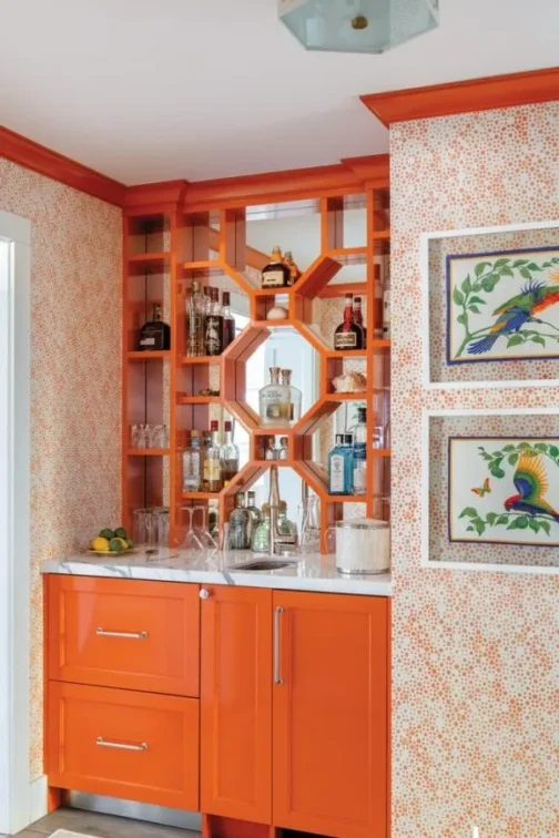
Orange
Orange is a self-assured and entertaining colour that blends the vigour of red and the joy of yellow. The colour encourages mental activity and creativity.
![]()
![]()
![]()
![]()
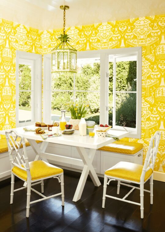
Yellow
Bright and lively, this colour can energize the environment and evoke happy feelings.
Pink
Pink is a relaxing colour related to femininity, love, and kindness. It’s a charming hue that can evoke romance and tranquil vibes.
Four tips for using colour at home
- Remember colour psychology: As mentioned above colours evoke certain emotions and this is definitely worth considering before you redecorate a room. How do you want to feel in the space? Consider the psychology of your selected colour before making the investment.
- Use the 60-30-10 rule: Sometimes, you can feel a little lost when creating colourful home decor, but this rule will simplify the process. It´s simple: paint 60% of the room with the most important hues; then, you can choose a complementary colour for the next 30%, and in the remaining 10%, you can play with a third accent colour.
- Play with patterns and texture: You can include colour in many ways – from furniture and rugs to accessories. Create even greater visual interest with different textures, materials, and patterns.
- Create a harmonious space with contrast: When creating a colourful home, consider contrasts and how these will best work in your space. Use the color wheel to discover the best combinations and contrasts.


You might also like...
-
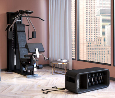
Technogym: Strength & Fitness Redefined

Enjoy the quest for a stronger, healthier body with premium equipment for your home gym that’s designed to maximize your results. Technogym has the ...
-
New Features on The Home Channel

The Home Channel has brand-new, exciting shows lined up for November 2024. Don’t miss out on hours of entertainment with some of the most incredible ...
-
Step Inside The One By Express Fitness

The One in Stellenbosch is an iconic, fully managed student development consisting of 508 luxury units, and is one of the most amenity-rich student living ...
-
Why You’re Missing Out Without ShineOn’s Cleaning Service (And What It’s Costing You)

Think about your home for a second. Your sanctuary. The place where you’re supposed to feel completely at ease. But if we’re being honest, ...


Visit SA Decor & Design on social media


