


House of Kook : Nature Inspired Winter Colours
There’s no mistaking it, winter is here and it’s the perfect time to cosy up your home for the season. From the warmth of crackling fires to the refreshing rains that bring life to the landscape, this season offers a unique charm worth celebrating. With a nature-inspired focus, House of Kook partnered up with Versus Paints, luxury paint specialists offering eco-friendly paint alternatives. Versus have formulated wall coatings that considerably decrease the amount of damage done to one’s immediate environment and the environment as a whole.
In the words of Pinterest Predicts “say yes to orange”. We’re talking burnt orange, terracotta and copper. And it’s not just orange that is predicted to trend in 2023 and beyond, its blue, lavender, pink and brown.
And let’s not forget Pantones colour of the year Viva Magenta, which Leatrice Eiseman says “vibrates vim and vigour”.
But if you aren’t quite ready to paint your room bright red just yet, read on for 4 toned-down versions of colour trends that Kook and Versus believe are here for the long-haul.


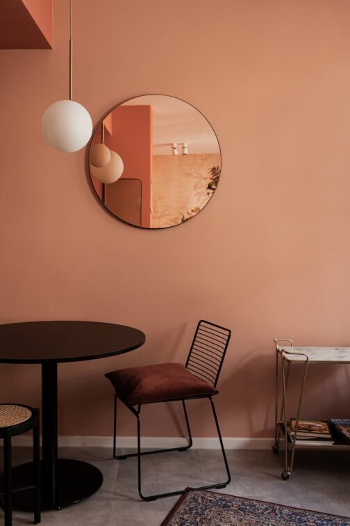
Salmon
1. ORANGE
It’s a no-brainer to add warmth to your space in the cold months of winter, but the hue has to be just right. You need stylish, sophisticated and ‘you’ll-still-love-it-in-summer- colours’. These soft terracotta, salmon and burnt orange colours are perfect. And a personal favourite, the turmeric yellow – a more daring choice but very chic.


 turnermic-yellow
2. PURPLE
There is a reason purple is a royal colour. This velvety, rich and luxurious hue is sure to add elegance to your space. It’s plum, but with a chocolately brown added in. It’s soft and feminine and drama-filled all at the same time. Pair it with dark shades of grey, and pops of off white to create depth and interest.


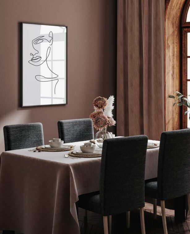
chocolate shake
3. GREEN
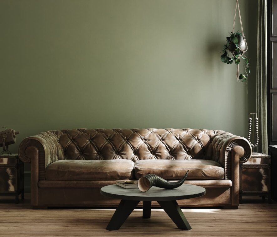
Adding green to an interior is a classic. And we are not about to re-invent any wheels here. This gorgeous hue is exactly the right balance of dark and moody but not too overpowering that you’ll tire of it in warmer months.


4. NEUTRAL
These are tones we love now, and we will love forever. While they have warm undertones which is perfect for colder months, this is a classic mid-tone neutral that will stand the test of time – cold, warm, rain or shine


mushroom beige
For the month of June Versus are also running a 20% off all paints online. Promocode DAD20




You might also like...
-
Caesarstone White Attica Brings Lasting Beauty to Siba Deli

When celebrated chef Siba Mtongana unveiled Siba Deli in Cape Town’s Longkloof precinct, the vision extended far beyond creating another beautiful dining destination. Every detail ...
-
From Bare Bones to Beautiful Balance: The Art of Layered Office Transformation

We chat to Dr. Shana Mavee, Founder and Creative Director of Epiphany Creations. There is something profoundly honest about a space before it becomes beautiful. ...
-
Epiphany Creations: Cosy Winter-Ready Living Spaces for Timeless Homes

As the cooler months settle in, homes naturally become the spaces most people retreat to—places where comfort, warmth, and connection take priority. Epiphany Creations believes ...
-
Easter Styling & Entertaining by Epiphany Creations

At Epiphany Creations, truly beautiful design is timeless, and sometimes the most meaningful spaces are those that evolve and transcend with the seasons. The brand’s ...


Visit SA Decor & Design on social media


